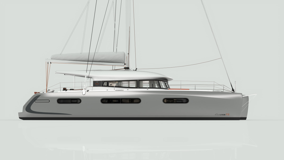
The Excess team wanted to add a final touch, an extra bit of soul to these already well-bred boats. Something really elegant and distinctive.
Isabelle Keller has always drawn, and having studied art, her passion for sailing naturally led her to focus on sailboats: “I have sailed a lot, racing, with a crew and I have shared the life of a professional sailor for a long time. I have experienced ocean racing and great adventures like the Transats and the Vendée Globe, from the inside. And then, on a simpler level, I have always wanted to live by the sea, overlooking the Atlantic Ocean.”
The initial discussions between the graphic designer and the other members of the Excess design team served to gain a clear understanding of the specificities and challenges of this new brand. We were waiting for a breath of fresh air. Isabelle's idea was to highlight the shapes of the hulls, using the graphic identity of the Excess. The sailboat had to be marked clearly and visually, while respecting the lines and accentuating her appearance.


